You Are. You Eat. Cafeteria.
Any good New Yorker has found him/herself at Cafeteria ordering contemporary comfort food as the sun comes up. This restaurant holds a special place in my heart because a cocktail-crawl lead by the heavy hitters of Cafeteria was the impetus for my move to New York. Cafeteria has been around for a while, but they regularly change the menus and always stay up-to-date, remaining a favorite in the Big Apple for 15 years. Now, on to the design comments…
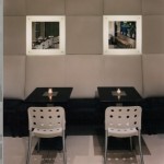
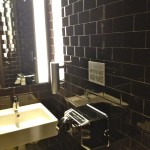
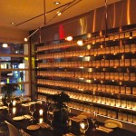
Recently Cafeteria undertook a remodel so I stopped in this week for the grand tour. They extended the top level to create a private dinning room that can be closed off for large parties or opened up as a communal table. Along the wall is an art installation that will eventually rotate, but has started out as a Warhol-esque arrangement of Cafeteria branded soup cans. The cans add a modern element and the repetition prevents it from being too distracting. The opposite wall is cushioned with square leather panels. I love leather finishing; it is simple and durable and at the same time, refined and elegant (keep an eye out for another post about leather interiors). There is a private bathroom which is lined with glass subway tiles, hand-painted in chocolate brown, maintaining a throw-back New York design with a contemporary twist.
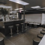
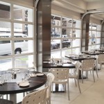
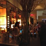
In the main dining area, all of the wooden tables and counter tops are Wenge wood imported from Africa and refinished in Sweden before being shipped to New York for 24-hour dining. I love the renovations, but my favorite design element is still the glass garage door along the entire front of the building. In the summer it can be reeled up, opening up the entire restaurant and allowing for semi-outdoor seating.
For those of you visiting New York, Cafeteria is a must-see. Check out the remodel and you may even recognize faces because Cafeteria often feeds an A-list crowd. Nice work, Caf!
Check out the Cafeteria blog or follow them on instagram (cafeterianyc).


0 Comments